Followers

Showing posts with label Design Team. Show all posts

Friday, 5 December 2014

Simply...

...wing Bling it !!!

Despite all my good intentions to be more organised with my Christmas cards this year, time has run away from me yet again. So I thought it was time to make a dent in the lacking numbers.

This lovely digital set of images from Nicecrane designs are fabulous...
...and so adaptable for Christmas cards or notelets.
As the images all have a blue/grey tint to them, I grabbed the following stash...
 ...smooth white CS, aqua glitter card and some aqua gems.
I cut the CS to A5 then folded in half before running the front of the card through my Big Shot...
...using a "Couture Creations" embossing folder called 'Moonlit Berries'.
The images were printed and trimmed...
...and some "Cosmic Shimmer" twinkles applied to the bows on the ladies hats.
I cut a snowflake from the glitter card using a DoCrafts punch (the punch didn't like the glitter card and I ended up banging the punch on the ground to release the cut-out - should have stuck with my dies)...
 ...the snowflake was added to the card and then I used some gems to pick out some of the embossed berries.
This is the finished card...
...fairly quick and simple (if you don't have to fight with a punch - LOL) and a way to boost the numbers of Christmas cards you have ready before the posting deadline.

If you are fast running out of time, don't panic - pop over to the Nicecrane Design site and grab some lovely seasonal images and if you are stuck for some inspiration, hop over to the Nicecrane blog as there are some wonderful Christmas ideas over there........................................................

Sunday, 23 November 2014

The perfect way...

...to spend a birthday.

The weather was pretty awful but it didn't matter because the company was great and we all enjoyed getting mucky.

Andy ran a similar workshop earlier in the year but this time we were thinking more about Christmas and making a decorative piece for the home or to give as a gift.

Starting with a 12x12 pre-gesso'd canvas we were let loose to rummage through boxes of embellies and dies...
 ...roughly planning out the layout before making a start on the actual piece.

As this was a Christmas piece I wanted to use one of Ignacio's Christmas digi images (Nicecrane Designs) as a focal point on the piece - who better than Santa arriving with the gifts.

Having carefully transferred all the bits & bobs onto a sheet...
...I made a start adding some texture to the canvas using texture paste and stencils...
 ...some brickwork and snowflakes seemed ideal...
 ...and then I started adding some burlap - the texture and the frayed edges create a lot of interest...
 ...and is easy to wrap over to the sides to continue the 'look'.

All the bits & bobs were gradually attached to the canvas and given a good coating of gesso...
 ...a trusty post-it note protected the printed image.

Things never go back onto the canvas in the same layout as you start with - bits get moved and you come across other things that you want to add but it doesn't matter - the idea is to create something that you find pleasing.

Once everything was on and coated with gesso, the whole thing was given a blast with a heat gun to ensure it was completely dry before adding some colour...
 ...I covered everything with acrylic paint and then spritzed with a Tim Holts Distress spray in a brass shade...
 ...the spray is great for getting into all the nooks & crannies that brushes find difficult...
...I then used some gold acrylic paint to dry-brush certain areas to give more depth.

When the light improves a bit, I'll take some pictures of it on the wall.

My friend Hilary went for a red & gold theme...
 ...I love the wooden words that she used.
Tina kept her canvas fairly pale with a slight hint of cream...
 ...and highlighted some areas with a light plum shade.
Andy also played during the workshop...
...and his was a lovely blue & silver scheme with lots of texture.
Tina's daughter decided she didn't want a Christmas piece. So she made her canvas for her bedroom...
...and included the name of her favourite band. The 'firework' effect around the edge was hand painted with a variety of acrylic paints.

Considering we all started with a white canvas, all five pieces ended up very different.

There was a sixth canvas that was sprayed and had five Sizzix lampposts attached to it - that was my birthday present from the class...a starting point for me to have a play with. When I make up my mind what I'm going to add to it, I'll show you all some pictures.

I really enjoyed my day - so thank you to Andy & Pinnacle Crafts and Hilary & my fellow crafters for making my day so special. I had a fabulous time.........................................................

Sunday, 16 November 2014

A quick & easy...

...Christmas gift.

This time of year there are some lovely decorated mugs around but a mug on its own is a bit of a boring gift.

You could knit a "Mug Hug" to add to the gift but then you are covering up the design of the mug - what a waste. Or you may not be a knitter.

So why not dig out some suitable stamps, rubber, clear or digi and make some coasters.

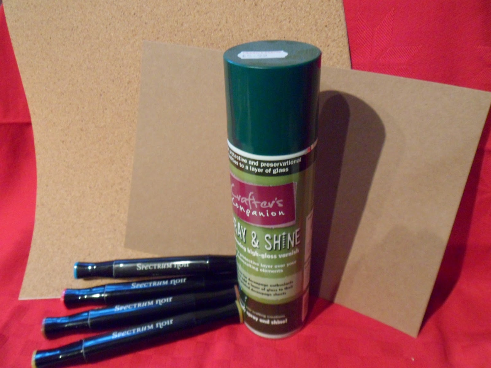
You don't need very much...
...some CS, your colouring medium, something to seal the finished item and some cork. I used a sheet of adhesive backed cork but if you have some old cork tiles hanging around at home - make use of those.
I printed some of the Grace Drayton images onto Kraft CS...
...you can find a lovely selection of these cute images over on the Nicecrane Designs website...
 ...I then coloured them using Spectrum Noir alcohol pens...
...which against the Kraft CS gave a shabby, vintage look to the images.
The images were then trimmed to size and the corners rounded...
...before attaching them to the cork.
Add a couple of pretty mugs...
...and there you have it - a quick and easy gift that shows you have given it a bit of thought as you can 'theme' the designs to suit the folk who will receive it.

You all know that my photography is not the best in the world so the pictures above were taken before I sealed the images - to have to deal with shine as well as shadows in the wrong places was more than I could cope with on a Sunday morning **giggle**

Do hop over to the Nicecrane blog where you will find lots of lovely ideas from the DT and if Grace Drayton images aren't your thing, pay the Nicecrane design site a visit and have a browse - there are images there to suit all tastes...and if you don't colour or haven't the time, there are lots of pre-coloured images that you could use instead. Do hop over there and take a look..................................

Saturday, 11 October 2014

Try mixing it up...

...don't be afraid to use different colouring mediums on the same piece.

Ignacio of Nicecrane Designs, recently asked me to have a go at colouring images from one of his new collections - he wanted examples on white & a darker background. So I printed some images onto some smooth white CS and some Neenah CS in 'Desert Storm' (pale kraft colour).

Here are the images printed out...
...and as you can see, the subject matter is some playful pups.
Grabbing my Spectrum Noir pens, I made a start on the white CS and started with some basic shades to start things off...
...I swept over the background with some CG1 (citrus green) and started to colour the pup with TN3 & TN6 from the tan range but I wanted to try the image on the kraft CS...
...some white pencil quickly started to bring the image to life and some biscuit shades started to bring dimension to the image...
 ...but the pencils were not strong enough to create sufficient colour in the background so I decided to mix in some Spectrum Noir pens...
 ...as you can see, the pencils and pens work well together.
I returned to finish off the image on the white CS and kept mainly to the pens...
 ...except for the pup in the water - he was given a touch of white pencil to 'tone-down' the tan colour slightly.
Here are the two completed images...
...the colour of the background CS really does give a different effect to the two pieces but so does mixing your colouring mediums. I'm sure some of you have watched demonstrators colour with alcohol pens and then they will use pencils (Prisma colour/Spectrum Noir) to highlight specific areas. What I wanted to show here was the fact that you can colour different areas of an image with different colouring mediums to produce the finish that you want.

The puppy on the kraft CS coloured with pencils looks very different from the puppy on the white CS coloured with alcohol pens but each works in its own way.

This set of images (by Cecil Aldin) is just one of the many fabulous sets that you can find over at the Nicecrane Design site and if you are looking for some inspiration as to how to use them, the DT over at the Nicecrane blog have lots of super ideas to share with you - please do hop over and take a look................................................................ 

Thursday, 18 September 2014

Ignacio has worked his magic...

...just look at what he did.

With a bit of techy whizziness...
...the photo of the journal looks much better (one day I will learn how to do stuff like this).
 
However, take a look at these...


 ...one bright image on white CS...
 ...and one muted image on kraft CS. Ignatio has cleverly used my coloured images on the vintage library card digi set. He has also very kindly offered this one as a Freebie for a limited period...
...so if you haven't already had a hop over there to take a look at all the super work done by the DT, you really should go and take a look and you can pick up a Freebie whilst you are there. You can hop over to the Nicecrane blog here..............................................................................


Saturday, 23 August 2014

As we head towards...

...the end of August - there is already a chilly feel to mornings.

Autumn seems to be arriving early here in the UK.

Many folk are getting their children ready to return to school after the Summer break and there are lots of crafters out there who are already in full "Christmas" mode (sorry Suzie, had to use the "C" word). However, there is another event that is only just over two months away - Halloween.

Now here in the UK we don't seem to celebrate this event to the same extent as our friends across The Pond but it has become more popular in recent years and whilst our British 'stiff upper lip' might frown on the knocking on doors 'trick or treating' part of the of the occasion, many folk now have Halloween parties...and not just for the kiddies - grown-ups (???) are having fun dressing up and attending themed parties.

Parties take a fair bit of organising when there are costumes and decorations to sort out so I thought I would show you a quick treat bag that can be used for kiddies and grown-ups alike.

Using my WRMK gift bag score/punch board I made a simple bag from a sheet of white A4 CS...
 ...I kept everything B/W for simplicity...
 ...the lovely image is from Nicecrane Designs (as is the bat) and is just one of a fabulous selection of pre-coloured or B/W images that Ignacio has available on site.
Oh, and if you are wondering what to put in the bags...
...Loom bands are just the right bit of fun for the occasion as they come in some super Halloween-type colours and many glow in the dark.
So why don't you make a start now...
...and that will be something that you can tick off the list ready for your spooky event.

The Nicecrane site has been down for updating but is now open again and there are lots of new items so do hop over and take a look here and whilst you are at it...pay a visit to the Nicecrane blog to see all the super things that the DT have been making..............................................................................

Wednesday, 23 July 2014

Too hot, lacking sleep but...

...a Bugaboo "Christmas in July" winner.


Despite the heat making it very difficult to think of Christmas makes, I really enjoyed last week's challenge event over at the Catch the Bug Challenge Blog.

I won some digi images that I will play with when things cool down a bit.

I so do not want to moan about the lovely warm weather but it has brought with it a lot of thunder storms and a few flash floods which haven't been great. I also don't find this heavy, humid atmosphere very motivating craft-wise.

The lack of sleep is certainly catching up with me which isn't helping with things at work. We have just had an IT refresh and I now have a two-monitor set-up on my desk that I have got to try and get my head around...groan.

So if you are wondering where my crafty makes are - I'm still trying to pull the ideas from my over heated, very tired brain.

I have done some colouring and have a couple of Nicecrane images completed and a super cute sprite from Aurora Wings ready and waiting to be made into something. Perhaps when I've caught up on some 'shut-eye'..................................................................................

Monday, 7 July 2014

Grab your Sunbonnets...

...Summer is here.

Well it was...then it rained...typical British Summertime weather.

However, what I was really referring to was the latest digi stamps from Nicecrane...
The Sunbonnet Babies DSL - Click Image to Close
...this is just one of the new design sheets that Ignacio has over on the Nicecrane Design site and you can grab this one here.

Ignacio sent me these images and asked me to colour them and this is what I have so far...

This image was coloured with a mixture of Derwent Coloursoft & Pastel pencils...
...when used on Kraft card this gives an almost 'chalky' feel to the image...
...and also enables you to keep things very soft looking. This is very much in keeping with the way the images first appeared when they were published as the illustrations for the 'Primer' but I wanted to see what they would look like coloured a little more boldly.

This image was coloured using Spectrum Noir alcohol pens on smooth white CS...
 ...and as you can see, the colours used are more vivid but not too "in your face"...
 ...the stronger colours also give the ability for more shading when colouring and this helps to give the image a bit more depth. However, if you fancy something with a more vintage feel - how about this...
 ...I coloured the same image again using a limited selection of pencil colours on Kraft CS...
 ...in places there is just a hint of colour and by applying colour more strongly in some places you can still achieve a shaded effect. The softer colours also make the image seem like part of the CS...
...as none of the colours are overly bright. A very different finished look to the alcohol pens.

This new range of images are really sweet and there is plenty of possibility for mixing and matching techniques - how about paper-piecing the bonnets in your favourite PPs or printing onto a more textured CS to give the look of canvas - there really is no limit as to what you can do.

If you would like to see some of the things the rest of the DT have come up with, do hop over to the Nicecrane blog.....................................................................


Wednesday, 2 July 2014

Crafting with...

...Kraft.

I love the natural feel Kraft card gives to a project but boy does it come in a range of shades - anything from a light 'grubby' beige to the darker 'looks like wet sand' colour.

If you are a card maker, you will probably be aware that card blanks usually come from the darker end of the colour range. So if you want something paler, this means making your own. Not a problem, after all we are crafters and we make stuff. The sticking point comes over "time" - cutting & folding card blanks adds time to your projects, especially if you are making a batch of cards. Then there are the envelopes...

How many times have you merrily made a card from scratch only to find that it doesn't fit in a standard size envelope? Again, not a problem as we can make our own but once again we have the time factor.

Time is a big issue for many folk who enjoy crafting but 'life' limits the amount of time they have available in which to do it.

Then we come to the problem of colouring straight onto kraft card.

Pencils seem to work quite well irrespective of the darkness of the card and the Derwent Inktense pencils are rich enough to give a good depth of colour as I found here...

 
...and the Derwent Coloursoft pencils also gave a nice effect...

 ...especially when keeping to a limited selection of colours and only shading parts of the image.

But...

You knew there was going to be a 'but' didn't you. My preferred medium for colouring is alcohol pens and trying them on scraps of kraft card that I had really wasn't doing anything for me. The colour of the card was too dark for the pens to really be noticed. Then I tried Crafter's Companion Neenah card in the colour "Desert Storm". Wow, what a difference. The smoothness of the card is perfect for colouring with alcohol pens and the kraft colour is pale enough to allow the colours to show.

So I printed off some of the cute Grace Drayton images...
 ...and got stuck in...
 ...I did find that it was necessary to use stronger tones than I would normally reach for but it was so great being back in my comfort zone with my pens.
What about this little cutie...
 ...isn't she adorable. Now if you look at this image you may think that I have used something white on the bib area. In fact, I used a very pale aqua shade (BT1) and I think the blue has toned down the yellow tinge of the card making it look almost white.

All the images used have come from Nicecrane Designs and are from the following digi sets...

..."A Garden of Friends" which you can find here...
...and the Grace Drayton "Nursery Rhymes" that you can find here.

My printer is still playing silly wotsits so I'm having difficulty printing the latest images from Nicecrane - boy are there some super ones. Do hop over to the Nicecrane blog to catch up with what the rest of the DT have been playing with. There is some fabulous work over there............................