...when technology doesn't want to play nice.
I know it is probably my own fault for using CS that was too thick for my printer (see post here) but for some reason my printer isn't printing correctly - even though I set it to Black printing, it is throwing in a bit of blue. Annoying but at least it is still printing.
After playing with my Inktense pencils, I wanted to see what this Nicecrane Design image looked like using alcohol ink pens.
Having printed the digital image onto smooth white CS (160gsm this time) I started with some basic laying down of colour...
...the hair for both the boy and girl was coloured using TN1, GB1, GB6, GB7 pens from the Spectrum Noir range. The boy's outfit was given an all over layer of TB1 with a little TB2 on the shadows. At this point, the skin was just given a base of FS1...
...and the girl's outfit was started with DG3 on the darkest areas blending into DG2.
The coat was finished off using DG1 all over and the hat was given a straw-like colour by using EB1, EB2 and just a hint of TN7 to darken the shadows...
...whilst the skin areas were finished off using TN1, TN2, FS7 and then the FS1 again for blending.
The boy's outfit was then given a bit more depth by adding TB3 and blending back with TB2, TB1 then a touch of CR8 was used to create the red trim and IG1 was used to create the shadows on the hat and socks...
...the dustbin was coloured using BGR1, BGR2, BGR3, BGR4, BGR5 and the Blender to remove some of the colour where the light would hit on the curved surface...
...ground shadow was created using BG5.
The scruffy little mutt was coloured using TN3, GB3 and some IG1 to 'dirty up' the white fur...
...and a little touch of FS7 for his tongue.
The ground was given some sweeps of BG2 blended in with the BG5 of the darker shadows...
...and the general background was given a sweep over of TN1.
The alcohol pens create a very different look to the Inktense pencils.
This is just one of the images from the new digi-stamp set...
..."A Garden of Friends" which will be available on the Nicecrane Design site.
The DT have been busy using items from Ignacio's May release of designs - you really should pop over to the Nicecrane blog to take a look at what they have been creating.........................................
Monday, 26 May 2014
Sunday, 25 May 2014
Retail therapy and...
...catching up with friends.
This weekend is "Members Weekend" at Pinnacle Crafts so as usual I had Friday off to take advantage of the 30% discount before everything I wanted sold out (I know you can order stuff and still get your discount but it's not quite the same as bringing things home straight away).
A phone call from Suzie on Wednesday and a text from Hilary first thing Friday, confirmed we would all be there.
I have been very good this month about not spending too much as I knew there were several items that I wanted to get and Members Weekend actual falls a week before payday this time.
I met Hilary at the door and as soon as they opened I was heading for the two items at the top of my list as I knew they only had limited stocks - got!!! - so then I was able to wander around at a more leisurely pace. Suzie arrived and we were all shortly paying for what had 'jumped' into our baskets before heading for coffee and a late breakfast. Of course we had to inspect each others purchases and then it was back for "Round 2"...just in case there was anything we had missed. A hug for Hilary who was being picked up by hubby and Suzie & I headed back for another coffee. Inktense colour chart updated with the latest purchases and then back for "Round 3" - I kid you not.
The weather had been very unpredictable with a few spits of rain, grey clouds, strong breeze & sunny spells but when Suzie & I headed off in our own directions I decided to drive up to Langdon Hills on my way home. When I had a dog it was somewhere I went almost daily but since then I haven't even driven through. As the sun had come out I decided to park and sit in the sun reading for a while.
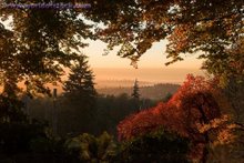
Would you believe this photo...
...and the next were taken from exactly the same spot...
...just a bit of Zoom and you can actually see Basildon Hospital.
The view in the other direction is towards the Thames...
...and where there used to be two oil refineries...
...they are now building the Gateway Port.
It is lovely up on Langdon Hills...
...lots of greenery...
...trees & shrubs in bloom...
...pleasant walkways...
...even the parking area is pleasantly laid out...
...with a warden's building to the back.
It seems strange that all this beauty can be so close to...
...an ever increasing industrial area - the cranes are for unloading ships in the first of the 5 completed 'gates' of the port.
Since I last visited there have been a number of additions...
...art works created out of fallen branches...
and other materials found locally. Along with steps...
...that make the steeper areas more accessible.
The warden's building and...
...information centre is now used, whilst natural ponds...
...have been tended...
...and made safe for folk to view.
A beautiful variety of trees...
...fill the area with different shapes...
...and colours.
Next to the car park is this structure...
...it is made completely from recycled items - fallen trees/branches - there is a wall made from glass bottles and as you can see - the roof is planted with grass and woodland plants.
There are more pieces of artwork as you wander around...
...reminded me of something out of Harry Potter.
Which ever way you looked...
...there was grass and trees...
...even right up to the parking area. It was lovely just sitting and pretending that work/commuting/city-life were a very long way away and it felt like the perfect end to the day.
I got home and unpacked my goodies just as the weather changed and boy did the rain come down........................................................................
Wednesday, 21 May 2014
There are things that crafters...
...shouldn't do - but we do!
Last Monday Ignacio (Nicecrane Designs) sent me this lovely collection of digi images...
...and I so wanted to get colouring as soon as possible - but things have been a bit hectic and I was really too tired to even think about making a start. However, on Tuesday I was thinking about trying something a bit different to my normal colouring using my alcohol pens.
I haven't 'played' with my Inktense pencils for quite some time...
...and thought it would be fun to use them to colour some images that had been printed on 'kraft' coloured CS.
This is where my introduction hopefully starts to make more sense.
Crafters should not try new techniques or revisit ones that they have not used for a while when they are tired...it really isn't a good idea to try out stuff when you are far too tired to really concentrate on what you are doing.
Crafters should not load their printers with cardstock without thinking about the gsm...being tired means that you can easily forget the capabilities of your printer - as I did - and you run the risk of causing damage that could be quite costly (the noise that my printer made in protest was quite a wake-up call I can tell you).
Crafters should not try colouring things on a darkish background in poor light...it doesn't bode well for the finished result and makes it quite difficult to realise when enough is enough and you really should stop tinkering with the piece of work.
This was the result of my efforts last night and I think I just about managed to stop before the image got spoilt...
...and I have decided that it will be better to continue this in daylight so that I can see the colours properly and not to work on it after a busy day at work and having to cope with a long commute.
I'm liking the general effect that the Inktense pencils give so I certainly think it will be a technique that I will revisit more often......................................................................
Tuesday, 13 May 2014
Grace Drayton images...
...from Nicecrane Designs.
Part of Ignacio's May release of images is a set of characters created by Grace Drayton - the artist who created the Campbell's Soup advertising using jolly little round faced children. This is the sheet of images...
...and you can grab a set for yourselves - here.
I didn't want to use these images to make cards so I had a rummage around in my re-cycling cupboard (I find it very hard to throw certain types of things away as they "might come in useful")...
...this container seemed perfect for the job...
...and this is what it looked like after a quick bit of covering with CS and Washi tape. For some reason I had the Campbell Soup cans in my mind, hence the red/white/black colour scheme.
I printed the images quite small (wallet size which allows 9 to a sheet of A4)...
...and started colouring them with my Spectrum Noir pens...
...and as you can see, this is what they looked like whilst in progress.
The fully coloured images were cut out using a die from the X-cut plain circle set...
...and mounted onto a slightly larger piece of black CS that had been cut with the X-cut scalloped circle set. I then curved the images by rubbing them over the edge of my desk so that they would sit more comfortably round the container...
...I picked this image for the front - but as you can see...
...it is not so easy showing how the other images are placed...
...when you are looking at something that is tube shaped.
With the recent chilly spell of weather we have been having lately, I've been knitting scarves again and this container is just the right size...
...to hold the scarf snug and safe.
This is the finished container with an added piece of ribbon tied around the bottom...
((OOPS!!! published instead of saved - will be back later to add links and finish post. I was in such a rush this morning that I hit 'publish' instead of save, so I'm now back to fill in the links and finish off the post.))
These images were real cuties to colour and had me thinking of lots of the artwork that has been used in advertising - many of which have been revived in recent years...remember the Bisto Kids? I thought this set of images were just right for the gift packaging that I wanted to create.
There are some absolutely fabulous images available in the May release at Nicecrane and you really must hop over to the blog to take a look at all the lovely ideas that the DT have been coming up with..............................................................
Sunday, 4 May 2014
Happy 5th Birthday to...
...Polkadoodles.
The folk over at Polkadoodles are celebrating with a blog hop that involves some super freebies along the way and a grand prize for someone picked at random.
You really do need to hop on over there to be able to join in the fun.
Wishing everyone at Polkadoodles a very Happy Birthday.....................................................................
"What Kids can Teach Us"...
...is a fabulous new design sheet from Nicecrane Designs.
Aren't these images just wonderful! You can find them here.
Now I know some of you will be looking at these images and think they are quite dark so you may not feel you could colour them. Don't be put off, the effect you get when colouring with alcohol pens is amazing and for those of you who are still not very confident with your shading they are perfect because the image does a lot of the work for you.
Just take a look at this...
...the darker image allows you to use some of the stronger colours when colouring, without them appearing too bright. A closer look shows that you can still create depth...
...and shading with your colours still helps to bring the image to life.
This was the card I made with the image...
...the card blank is 8x8 (kraft) then a matt of white CS followed by a blue PP from the Do Crafts "Sew Lovely" range. The filigree frame is from Tonic - cut in white CS.
Because the colours are quite rich on this...
...I kept the embellishment to a minimum. A crushed silk bow...
...and a few pearls.
I downloaded this image when I got home from work on Friday and had it printed and coloured before bedtime. However, as I was busy yesterday it wasn't until this morning that I was able to complete the card and get the pictures loaded to the PC.
Ignacio (Nicecrane Designs) has such a wonderful collection of images available on his site and he is very generous with what he sends to his DT...I just don't have enough hours in the day to make use of them all as quickly as I would like to.
Perhaps if I could win the lottery....................................................................................
Subscribe to:
Comments (Atom)


