I love the natural feel Kraft card gives to a project but boy does it come in a range of shades - anything from a light 'grubby' beige to the darker 'looks like wet sand' colour.
If you are a card maker, you will probably be aware that card blanks usually come from the darker end of the colour range. So if you want something paler, this means making your own. Not a problem, after all we are crafters and we make stuff. The sticking point comes over "time" - cutting & folding card blanks adds time to your projects, especially if you are making a batch of cards. Then there are the envelopes...
How many times have you merrily made a card from scratch only to find that it doesn't fit in a standard size envelope? Again, not a problem as we can make our own but once again we have the time factor.
Time is a big issue for many folk who enjoy crafting but 'life' limits the amount of time they have available in which to do it.
Then we come to the problem of colouring straight onto kraft card.
Pencils seem to work quite well irrespective of the darkness of the card and the Derwent Inktense pencils are rich enough to give a good depth of colour as I found here...

...and the Derwent Coloursoft pencils also gave a nice effect...

But...
You knew there was going to be a 'but' didn't you. My preferred medium for colouring is alcohol pens and trying them on scraps of kraft card that I had really wasn't doing anything for me. The colour of the card was too dark for the pens to really be noticed. Then I tried Crafter's Companion Neenah card in the colour "Desert Storm". Wow, what a difference. The smoothness of the card is perfect for colouring with alcohol pens and the kraft colour is pale enough to allow the colours to show.
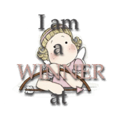
So I printed off some of the cute Grace Drayton images...


What about this little cutie...

All the images used have come from Nicecrane Designs and are from the following digi sets...


My printer is still playing silly wotsits so I'm having difficulty printing the latest images from Nicecrane - boy are there some super ones. Do hop over to the Nicecrane blog to catch up with what the rest of the DT have been playing with. There is some fabulous work over there............................


4 comments:
Wowww toni,,, love this tutorial about colring on dark surfaces,,,I love these grace Drayton colored girls sooo cute, so cute,,, and the incredible effect on the one from my "A Garden of Friends" Collection,,,, .you are Rick,,, and all over a Color`s Queen
Wow they look amazing, they have that vintage tone to them - no wonder you were pleased with them! Amazing stuff!
Wonderful creations here and the little tut on using the pencils which I have a problem with...love the card and have now joined as a new follower of your inspirational blog.xx
.aNNie ♥
The Journey is the Start
PS I have candy sponsored by three artist if you would like to join up and join in.
One word! ....... Stunning
Post a Comment