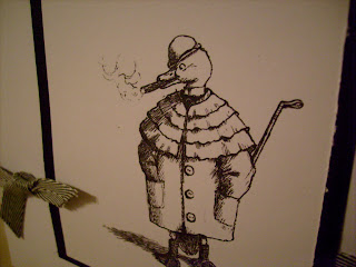
 A simple black and white card using a digi image provided by the Progressive challenges over at "CDAC" The cards have to have an Autumn/Fall feel to them - I think this little chappie's coat and the B&W colour scheme help to create a feeling of the year moving on and heading towards winter.
 The image is by Nicecrane Designs and is part of the cdacpc3 stage of the challenge that is being run. Enter a card using one of the freebie images at each stage of the event and you qualify for more freebies for the next stage. There are also opportunities to gain more digis by submitting multiple entries or getting your entries in quickly.
I am entering this card in both the Less is More and the CDAC Progressive Challenge.......................................


12 comments:
Lovely card cool image :)
Thank you so much for helping us in our challenge for 1000 entries
Mandi
LIM
This is really neat!
Thanks again, again.
Chrissie
"Less is More"
Good luck, you've ticked the boxes again
oh sweet! so simple and so effective.
Very neat indeed. You are doing a great job on your contributions for that challenge.
lovely card Toni
Have a good weekend
AllisonX
Really love this, unusual image- it's really cool.
C
xx
Fab card Toni, very original and perfect for a gent too
great work my friend
hugs June
Awesome card.. I dont know why But everytime I try to do a less is more card.. It never turns out..Wish I could get the hang of it.. Awesome work.. hugs, Linda
Oh I love ♥♥♥ this. S xxx
Fantastic CAS card! Love the small amount of ribbon running behind the image. Looks wonderful. Thank you so much for playing the CDAC PROGRESSIVE CHALLENGE
Shelby
Post a Comment